Acttitude

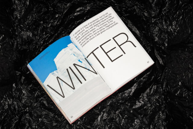
Diabla Talks: Editorial concept and graphic design – P.A.R

16 October, 2021
Diabla

Whatever they touch turns to gold. Iris Tarraga and Lucía Castro from P.A.R have taken responsibility for the editorial concept and graphic design of our catalogue, which you can download by clicking here. From their studio in Barcelona, they have dedicated themselves to shaking up their field of activity with creativity and freshness. They are masters in combining that disruptive attitude with harmony and balance in their designs, as well as precision in typography and color. Is that maybe why we chose them for Diabla?

Their style is clear and direct, but the loving care they have dedicated to Diabla can be seen in every page. Iris and Lucía are women of great talent that today are letting us take a few minutes to answers some questions, in the company of the lovely Dachshund, called Müller, that accompanies them in their studio.

Diabla
Although Gandia Blasco Group has celebrated its 80th birthday in 2021, Diabla is its youngest brand. Were you aware of it before this first collaboration? What was it that most affected you when you dove into its universe?
Lucía: We didn’t know the brand before, only from when they contacted us. We know lots of brands in the sector as we work fairly frequently in it, but not Diabla. When we stepped into its world, we were surprised by its narrative language and how the brand is expressed both through the image and through the sensations of use of the objects.

Iris: Personally, what surprised me most when we first looked into it was the vividness of the tones of the product. And, above all, the worlds and the attitude that the models take on in each of these worlds. The play of symmetries between the models and the product: it is as if each of the images were a work of art.
Diabla is all about freedom, flexibility and experimentation. Also, how was the commissioning of the 2021 catalogue?
L: Completely, and I think that this commission very much affects the way they work with their collaborators. Throughout the whole project they gave us lot of flexibility, both in the creative process and in making production decisions. The entire work with them was very flexible. It allowed us to do a very experimental editorial project from start to finish.

I: The creative process has been very flexible, at no time have they vetoed anything. From the very first moment they proposed the concept and, from there, we came up with several ideas. It has been very enriching to be able to work in this way, with this level of flexibility, because in the end it brings a value and a conceptual power that links absolutely everything, from the creative process to the design of the collections, the concept of the seasons (which adds value to the use of each collection throughout the year) and the fact of being able to generate these Diabla worlds and see them through a season, with the daring that this entails. It has been a pleasure to work with this flexibility, because in the end it is what gives weight to each of the design decisions that are made.
Diabla
Diabla
What has been the easiest and hardest part of translating Diabla’s identity into an editorial project?
L: Once you understand the concept of Diabla's brand identity, what you try to do is to bring it into the editorial field and, in that sense, I don't think we had any difficulty when it came to producing the piece. What we have tried to do is to transmit the character and the way of showing the product with its singularities. So, we have had practically no difficulties in translating this identity.

I: Actually, the moment you become immersed in the whole Diabla world, it is very easy to adapt the editorial piece to that language. For us it has been very natural.
How was the design process?
L-I: The design process was quite experimental, as we mentioned. In addition, the concept of the seasons gave us a lot of scope to try out different layouts. We tried to make them graphically related to the experiences that can be perceived in each season of the year. The truth is that it was very experimental and enriching.
We are in front of a catalogue, but it could well be a travel album, a magazine or even a book. Which definition do you feel you most identify with, given your recognized trajectory in the publishing world?
L-I: It's difficult to label this piece as a magazine, a book or a travel album. What we do know is that it is a Diabla piece and, as it is a company that offers a product, by its very definition it would be a catalogue.
Diabla
Diabla
Sustainability plays a fundamental role in your work. What has it meant to you to have had the opportunity to give visibility to these extreme and breathtakingly beautiful landscapes of our planet?
L-I: We think it is interesting to be able to show in an editorial piece how the product has been taken to different places in the world, extreme places (such as glaciers or deserts) and at the same time be able to explain things about that territory. It seemed to us that it was essential to be able to show the uniqueness of these spaces.

For us, responsibility at a sustainable level is not so much linked to the content, but to the process we have carried out for the elaboration of the catalogue. Above all, we refer to a choice of materials and production that is sustainable. For example, the fact of not using melamine or glues, that the catalogue has a die-cut, that the fastening element is a rope... These types of decisions are what lead us to generate the projects in the most sustainable way possible.
Diabla's catalogue can be downloaded from their website although you will surely agree that it is not the same as smelling and touching it. Why does paper still have that inexplicable magic? What are the not so lucky ones missing out on who can only browse it on their screen but not file it on their shelf?
L-I: As we said before, as it is not a standard catalogue, but has a different format, it has a different type of binding. The folding is different, it has a reversible outer jacket, the possibility of an inner insert... In general, it is a very handmade production. In addition, the printing has very accentuated chromatics. Seeing it digitally means that you lose this sensorial and experimental part that you get when you handle this editorial piece. Therefore, we believe that it is a piece that gains a lot when you contemplate it in your own hands.
When you saw the campaign photos of the new collections, could you suppress the urge to try out what GRILL, LILLY, ARP or PLISY UP feel like?
L-I: The truth is that we would have loved to try all the products and even more so if we could have done it in the locations where they have been placed!
Diabla
Diabla
Confession: to which extreme landscape would you like to travel with Diabla?
L-I: We agree that the places that most attract our attention are caves, such as the Cueva de los Verdes in Lanzarote or the Coves del Drach in Mallorca. We have also heard about some amazing glass caves in Iceland. In general, we would love to travel with Diabla to contemplative landscapes and wonderful environments.
And if you had to choose, where and at what time of the year would you escape with Diabla, and with which of the latest releases?
L-I: If we had to choose, we would go to the glaciers, but only with PLISY UP!
Did Müller like the result, and do you think he'd like to take a nap in the Touffu booth?
Müller: Aaaaaaaay! Yes, I like the result very much. I would love to take a nap in the Touffu hut in the sunflower field. Thanks for asking, I'm off to sleep!
Go to Diabla News
Ops!
Horizontal navigation on mobile sounds like fun, but it's not. A wise man once said that videos should be shot horizontally, while websites should be navigated vertically.